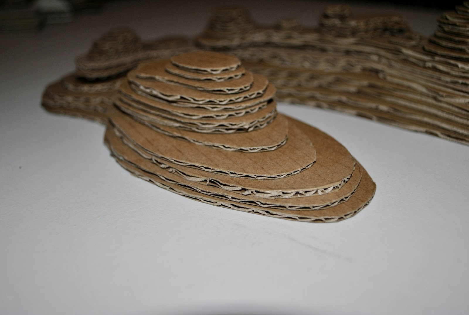
Looking at my model I had found two main geometric shapes : the triangle and the diamond. I had no idea really how these could become useful as blocks in their own right, so I just made some simple, cardboard replicas of them and made them three sheets deep (of the thick corrugated card). Amazingly once I had created just a small number of these blocks they really came to life.
The thickness made them versatile - I could stand them on end, put them upside down, the possibilities became endless and I spent a while forming stacks and patterns and taking photos of the different effects. In this case I did not glue them together I left them all as a 'kit' to build whatever I will need to in future projects.
Monday, 12 November 2012
Pixelated Model
This task was interesting as I had to figure out the size of block and the material to use - which really was the biggest challenge. the brief was very particular about them all being exactly the same.
I have found throughout this studio project and becoming a poor student again, I've had to be a bit of an eco-warrior and save,salvage and recycle everything. My landlady probably thinks I'm a bit strange as she brought round a new microwave for the kitchen - as she started walking out of the house with the big cardboard box and packaging I ran after her and asked if I could keep it! Fantastic thin corrugated card - for free!
I racked my brains for ideas for this pixelated model thinking along the lines of matchsticks (too fiddly!), matchstick boxes (that's a lot of matches to buy - and I don't smoke or have a fireplace), pencils (would I be able to cut all of these to exactly the same shape and size). I narrowed it down to what I had anyway at my house - the first being tampons which would actually make great building blocks, but I thought this could be slightly embarrassing for me if I got selected to show my work in the studio! An the second and final material was just some foam packaging I got with my new laptop - wonderfully easy to cut and stack.
The end result looked pretty messy and cutting them to be the same shape and size was actually pretty hard to do. So maybe tampons would've been the preferred material of choice?!
Material Transformation
Task: To stiffen the material and map the lines in 2D and reconstruct the vessel from rigid components.
In translating from one material to another, some forms or ideas remain constant, while other possibilities emerge as some are left behind. This is a process of transformation.
For this process, I first had to make my material model rigid. The fabric was lose and free, and so I had to figure out how to make it stay in only one shape forever. I used PVA mixed with water for the first coat so that it would soak into the material and form a semi-hard surface to apply more PVA onto. This process in itself was quite fascinating (even if it was literally watching glue dry!). Below are a series of photos I took of the wet glue and its effect on the material. Due to the lightness of the fabric and the heaviness of the glue and water, the material would sag in places it hadn't done before, and as I turned it to get an even coating, this increased the amount of new textures. The shine of the wet glue also made the object seem like something coming to life - the birth of a new form:
As we can see in the last photo, the material is really clinging to the frame. This reminded me of the way swimming trunks cling to skin after having been in the sea.
Thursday, 8 November 2012
Material Behavior
Task: To create a 'skin' for the wire armature
We were given a square of white fabric to work with - to experiment with how material works - the effects it can create by stitching it in different ways, S-T-R-E-T-C-Hing it, TWISTing it, SCRUNCHing it, or letting it fall in its own way and just respond to what it wants to do.
The white material was, for starter, not the nicest of fabrics to work with - it has no character and even as I experimented with it, it still felt like it would never be able to achieve the effects I wanted it to. And those effects relate to the wire armature. I wasnt going to insult the beautiful spiral by draping it in a hideous, boring white cloth. No, I wanted texture, I wanted creases, I wanted folds, I want to be able to see through it. At one point I was considering using a pair of opaque tights that would hug the wire model, but again I felt like that material didn't have enough substance to it. I found a fabric that had personality - it was thin, almost opaque, a dark red colour, that would stitch beautifully but was also able to express itself. As I stitched it onto the wire, it created forms that were better than I could have hoped for - it fell and twisted of its own accord, and, possibly due to my rather basic sewing skills, it scrunched in places, but then just around the spiral it would be held taught. When photographing it, I used the light to convey these forms which really speak for themselves:
They gave me the inspiration for the following gestural drawings - I used charcoal to really define the forms and emphasise the lines - trying to create a visual onomatopoeia:
Armature Model
Task: To imagine the 'meat and bones' beneath the skin of the model and create a wire armeture.
For me the 'imagining' what lies beneath the skin of my island was easy - there is something about my original model that speaks of its history - of the limestone karsts it represents - made up of thousands of years of decaying sea creatures (shells, bones etc), so rather than looking directly at the form of the island, I chose to chose something that would represent the meat and bones - something that would resemble both its strength and its weakness, its power and its delicacy, its magnificence and its insignificance - Those huge rock formations that support life, that resist the power of the ocean, that you can climb and feel so small next to, that are actually made up of tiny little remains of sea creatures! I looked at the strongest animal structures, which we also use in construction and the result was a spiral shell, like that of an ammonite fossil:
For me the 'imagining' what lies beneath the skin of my island was easy - there is something about my original model that speaks of its history - of the limestone karsts it represents - made up of thousands of years of decaying sea creatures (shells, bones etc), so rather than looking directly at the form of the island, I chose to chose something that would represent the meat and bones - something that would resemble both its strength and its weakness, its power and its delicacy, its magnificence and its insignificance - Those huge rock formations that support life, that resist the power of the ocean, that you can climb and feel so small next to, that are actually made up of tiny little remains of sea creatures! I looked at the strongest animal structures, which we also use in construction and the result was a spiral shell, like that of an ammonite fossil:
The ammonite not only reflects the theories I have put behind what it represents, but it is just simply a BEAUTIFUL shape and one which I would like to work with in order to proceed with my project.
Working with wire in order to make a spiral proved easier said than done - it just seemed to have a life of its own! The problem with working with such a perfect shape (spiral), is that unless I get it absolutely spot-on perfect, then it just doesn't work. I decided to use a prop to shape the wire around - the closest piece of equipment to hand was my water bottle:
Having perfected the spiral, demonstrating the strength of the island, I still wanted to include the delicate nature of its substance. I found a very thin wire (from a scourer!) and continued forming the shell using these. Despite all my best intentions and justifying what I had done, it kind of ended up looking like a Christmas decoration.... Note to self - money-saving idea for this winter, no need to buy tinsel, use scourers instead. Oh, and don't use scourers for any kind of model during this course unless its around the end of December when it may be appreciated.
Sunday, 4 November 2012
Laminated and Section Models
Task: To create a laminated contour model and a gridded sectional model using the contour plan of the island and sectional drawings.
Laminated Model: In order to create a laminated model, I traced each contour onto card and cut each to shape with a craft knife. This is the first time I have to cut card in an accurate manner which, I'm sure in time I will get better at (I hope!). I began by using grey-board, and by having never done this before it was so SO difficult! Accuracy seemed to be impossible and my fingers and arm muscles became sore and tired very quickly. I changed blades frequently (as recommended by my tutor), but apparently making models is not my calling - I'm not sure if I have the patience! After a day or two away from the project - soothing my arms and focusing on other projects, I came back to the project full of a new energy and motivation, and a bright idea of switching to a a thin corrugated-cardboard (I am a beginner after all!) which was much easier to cut and I am pleased with the results.
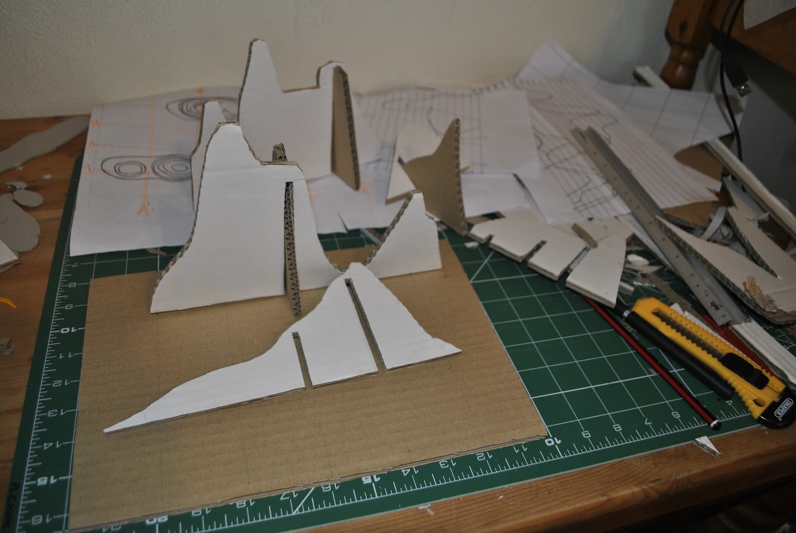
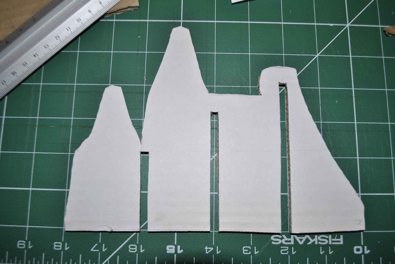
Sectional Model: For the section model, I figured out the sections all the way through the model based on a grid - with 5 evenly spaced sections along the width and the length. I then traced each of these sections onto card, cut them out and slotted them together. I used a thick corrugated card, and by changing my blade often I could get a better result, but I think due to the success of the thinner card on the laminated model, I will, in future, use thinner card as the sections did not turn out looking very neat. I would also find a better way of slotting the sections together - as it was as I was making it that I realised mistakes that I had made - for example, I can cut half way up one section and half way down the section to be slotted in to make the whole structure more sturdy. The effect really brought the model to life - being able to 'see-through' a landscape really helps to understand the topography.
Laminated Model: In order to create a laminated model, I traced each contour onto card and cut each to shape with a craft knife. This is the first time I have to cut card in an accurate manner which, I'm sure in time I will get better at (I hope!). I began by using grey-board, and by having never done this before it was so SO difficult! Accuracy seemed to be impossible and my fingers and arm muscles became sore and tired very quickly. I changed blades frequently (as recommended by my tutor), but apparently making models is not my calling - I'm not sure if I have the patience! After a day or two away from the project - soothing my arms and focusing on other projects, I came back to the project full of a new energy and motivation, and a bright idea of switching to a a thin corrugated-cardboard (I am a beginner after all!) which was much easier to cut and I am pleased with the results.
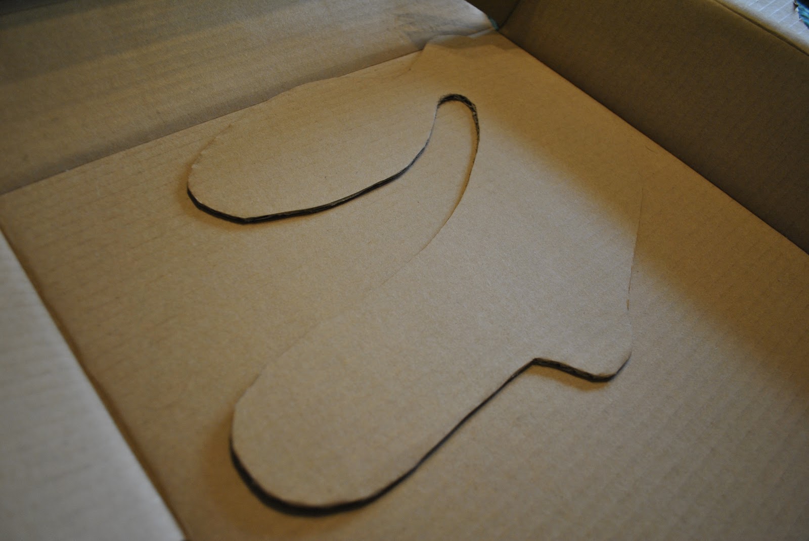 |
| The first layer - only 15 more to go! |
 |
| I really need to learn how to do all this work and keep a tidy work space! |
 |
| Adding slots |
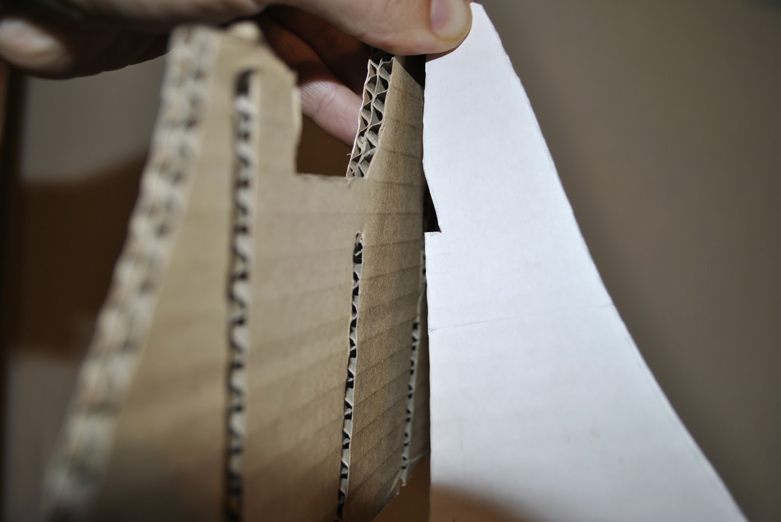 |
| Fitting the sections together - note here an extra cut for the sections to fit more snugly together |
Orthographic Island
Task: To create a measured hand drawing of my island on an A1 sheet including a contour plan of the island and a series of 5 sections.
For this part, creativity turned to technical, precise, measured drawings demonstrating the contour lines of the model. I quickly regretted the vertical cliffs that I had created because when you look at a map of land that changes gradient dramatically, the level of preciseness increases as all the lines are very close together:
For this part, creativity turned to technical, precise, measured drawings demonstrating the contour lines of the model. I quickly regretted the vertical cliffs that I had created because when you look at a map of land that changes gradient dramatically, the level of preciseness increases as all the lines are very close together:
To add insult to injury, I had made my island model about 5cm high and we were required to show at least 15 contours... this means figuring out accurate levels on this tiny and extremely textured model every 3mm! Due to the delicate nature of the model, I discussed the problem with my turtor and he brought in the idea that I could pretend this island has very high and low tides - and this model was currently at high tide! I could therefore map the lower contours as what I imagine to be happening beneath the surface of the water, and instead have countours at every 5mm. In order to get accurate lines, I had to put the model in a container and add enough water for the level to increase by 0.5cm each time, to get a level line all the way round. I marked the line at every contour. I then made thin slices across the model (painstaking work!) and then drew around each section to get a template of each line. I could then copy this onto an A1 sheet (to scale) to make a contour map of my island:
The dotted lines on the contour map indicate the 'below sea-level contours'.
Then came the section drawings where I used a graph-technique to depict where the gradient changed:
Although this process took a long time to complete, it really gave me a sense of the gradient of the islands - not quite as vertical as I initially thought. It also gave me a better understanding of scale and how to draw maps and sections - all essential skills for a landscape architect.
Subscribe to:
Comments (Atom)


