Friday, 18 January 2013

The Presentation


We are required to present our design idea to the two tutors and to the client. We had to include a presentation plan and 3 section elevations on A1 and also 3 perspective drawings also on A1. I scanned in all my images and used InDesign for a layout. Having never done this before, I found this the most challenging bit - the scanner left streaky marks across my drawings and when everything was printed the colours I had used were much darker than I had intended them to be and it was clear that I should've done the presentation plan on it's own A1 sheet as there is so much detail and would be much easier for the client to understand it at 1:100 than 1:200. It did not look as professional as I had hoped, but hopefully it demonstrates the design process I went through and that I have considered everything in the design brief. The perspective drawings came out well and really help to show what I hope the garden will look like. I am proud of my model as this is the area I have struggled with the most - I treated myself to some white card and a new knife and I was able to cut nice clean lines and also made the pergolas from match-sticks - tedious, but very satisfying when it worked. I used vertical exaggeration as the fences, buildings, pergolas, raised beds etc just looked too tiny at the base scale.

A1 presentation plan and section elevations (I added a scale bar after it was printed).

Perspective drawings. I included some images that inspired me to help the client gain a better image in his head of my ideas.

This is the presentation model I model mainly demonstrating the central feature as it was the hardest part to depict in images.

Monday, 14 January 2013

Formulating the design

The design process was lengthy - when there are so many objectives to fulfill it's hard to come up with something that satisfies every point in the brief. I would spend a while coming up with the dream design, only to realise I hadn't left room for a marquee, or the car parking space was too small for 11 mini-busses. The only way to show my process is looking through my sketch book which basically depicted every thought. Below are images from my sketch book and a model that I made. I will try to express my rather complicated thought process!

This sketch is of my initial idea of having different hexagons as areas - the smallest being in the middle that could be a  stage for a band, and then getting bigger and spiralling outwards using different materials and creating different moods for each area.
I did find however, that these spirals didnt really fit in the area.

I looked back at past garden designs, including this sketch of a contemporary garden design.

I ended up sketching a different kind of spiral - working on the golden section ration, with each line getting larger by 1.168 and ensuring I was only using 30,60 and 90 degree angles.

Below is a continuation of my sketches, figuring out how everything works together and finding where I can place elements. I decided quite early on I needed some vertical height and a reinforcement of the hexaganol/spiral deign that is obvious from ground level, so included pergolas at each join.


An idea for a water feature in the centre. This should be calming during the day, but well lit at night adds interest. I also wanted the view of the bowl to be half a hexagon, visible from all angles (elevation). It is surrounded by pebbles for a contemporary feel.
More sketches depicting moods and ideas:


I made a model to check my ideas were working together - I found that working at 1:100 was too big, but any smaller and the height was lost. I therefore used vertical elevation to show what's happening in the centre (and it was less fiddly!).


The model made my design work. I do feel, however that my design may be a little busy, but hopefully it means there is interest and intrigue.

I did a couple of perspective drawings to try to visualise the design from another angle.


My design is complete! I think I have thought of everything and below is the main plan. All I need to do now is make it presentable!


I decided to render the design with watercolour pencils, which looked really good, however, once scanned and printed at A1, the colours changed, and became much bolder than I intended - after the entire design process I feel like I have fallen at the final hurdle!

Perspective drawings showing planting:
 View from the Baa down the centre of the garden:
 The area by the brook, allowing interaction with nature:


The smoking shelter, surrounded by bamboo: 
 The final plan: 

A Garden for Entertainments: Planting Schemes

For my planting scheme, I decided to look for inspiration from a number of sources. I began thinking about what was already at the site, what would fit in with other planting schemes around Writtle College, other landscape architects and also draw on my own expereinces.

The design brief requests 'low maintenance' and 'contemporary' planting, but I also referred back to my own personal ethos for garden design - this includes making a garden wildlife friendly, be environmentally sustainable and also draw on what I have been inspired by during my travels.

When I was working in China, I designed an eco-camp made from bamboo. There, bamboo is obviously local and grows everywhere and structurally, it looks fantastic, especially in a contemporary garden - it has good 'architectural lines'. As outlined in the materials section, bamboo is an excellent eco-friendly product, but, as a plant, it absorbs carbon di oxide and releases 35% more oxygen than most plants and trees - which is great for reducing our carbon footprint!

On a similar note, I was recently in the Cotswolds and noticed a crop that I hadn't seen before - it looked like bamboo, but it couldn't be - surely?! Why would they be growing bamboo in the Cotswolds? The only explination I could come up with was that it must be for all those garden canes the Brits loe so much for growing beans up. Howevere, curiosity got the better of me and I found myself googling 'Bamboo crops, Cotswolds'. What came up surprised me - it was actually Miscantus (i think giganteus) and it's actually a bio-mass crop. It grows to 3m tall, is high yielding, environmentally friendly, easy to grow, low maintenence, annual growing cycle, no pesticides or fertiliser, increases wildlife biodiversity, eligable for cross compliance and has a long life span - sounds like a winner to me! It ticks all the boxes I need it to to include it in my planting plan and as a bio-mass crop, its educational for all those agricultural students who spend their time revising in the beer garden!

Little did I know, when I came back to Writtle, miscanthus was everywhere - including the entrance to the college itself!:

Miscanthus - Writtle College
After talking to my tutor about my ideas for planting, he suggested I took a look at James Van Sweden's garden designs. I took out some books from the library including 'Gardening with Nature' and 'The Artful Garden' both by Van Sweden.

I loved his gardens - he uses grasses and structural plants more than he does actual hard landscaping, with what I think is more of an impact. Below are a selection of his gardens that have inspires my planting schemes:

http://oehmevansweden.wordpress.com/tag/james-van-sweden/

http://federaltwist.blogspot.co.uk/2010/07/new-addition.html

http://livingarch.wordpress.com/2008/03/25/wonderful-meadow-grassy-garden/

In addition to my interest in bamboo and grasses and Van Sweden's work, I decided to walk around the campus and have a look at what is growing around Writtle for more inspiration:

Rhodrodendrom  in a woodland area - beautiful flowers.

The walk I take everyday through a woodland area - I love this short walk - the smell of pine needles an d a feeling of being alone, yet safe, surrounded by the majestic Pines.

Ground cover - green and fresh looking, despite it being January!

Strong structures emerging out of the subtle ground cover.

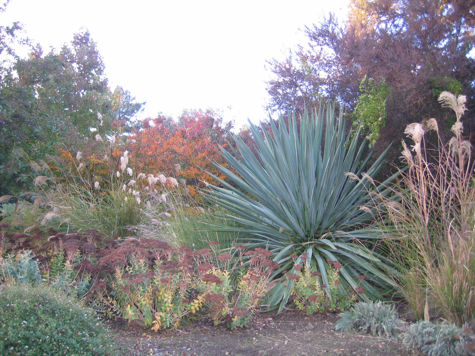
Grasses! Textures and colours brought out by each other - beautiful and strong lines.

Phormium

Miscanthus (my new favourite plant!)

More Miscanthus

It's everywhere - how have I only just noticed it?!

Miscanthus and cornus alba - great combination for structure and colour in winter

Pampas Grass already outside the Baa


Therefore, after an in-depth look at planting schemes I would like areas including ornamental grasses and bamboo's (Fangesia nitida). I have also reaslised with so many grasses, I need something that stands out - for some colour - possibly an Acer rubrum? Or a Ginkgo biloba? Or Cornus alba?

I am happy with my choices for plants, I just have to decide where to put them!